Regarding the prefectural Hyogo Tsu Museum, which is scheduled to open in November this year, we have decided on a logo mark by open recruitment in order to widely publicize the attractiveness of the facility.
1 Selection method
In February of this year, we solicited designs that integrate patterns and characters, and received 280 entries from Japan and overseas. The committee consisting of prefectural public relations producers, etc. selected and decided on the works to be adopted.
2 Decision details
(1) Design
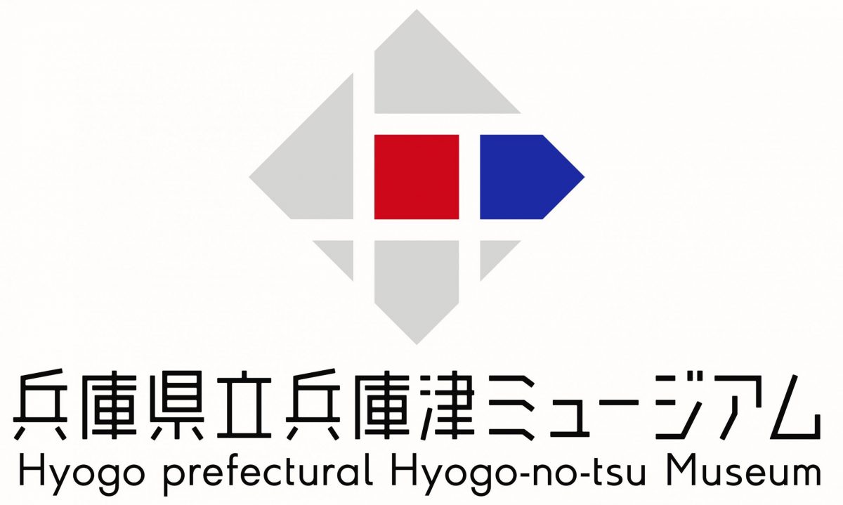
(2) Concept
・ The white line expresses the “soldier” of Hyogo
・ The red part in the center is the image of the “first prefectural office”, and the blue part is the image of the “Hyogo Hajimarikan”.
A design that does not feel strange to both “Japanese appearance” and “modern design”
The rhombus form embodies Hyogo, which expands and develops in all directions, up, down, left, right, north, south, east, and west.
(3) Author
Masatake Murakami (Setagaya-ku, Tokyo) Graphic designer


